
The Title of the film :
 - For our Title 'Bound To-get-her' , we chose to conform to the media thriller title conventions as we are appealing to a more mainstream audience. After conducting our product research, we discovered that red and black are colours mostly used in thrillers as they contain strong symbolism behind them.We chose to have a black background as it is a powerful colour which evokes strong emotions and a feel of emptiness. Black is the colour most commonly associated with secrets, power, violence, evil and the end,which is why we thought it would work well within our thiller opening. We then used red as although red is commonly used to represent blood and death, we figured we could use it for the other meaning behind it which is passion,infatuation and fire.
Setting /Location
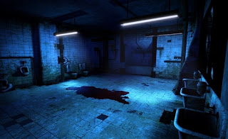 - Our opening was shot in 2 main locations, those being the toilets and a drama room. We overall wanted to create a feel of emptiness and isolation, and those 2 locations enabled us to achieve that ambience. We were able to manipulate the lighting in both locations to create the conventional dark lighting seen in thrillers. The gory suspenseful thriller 'Saw' had quite alot of dark lighting and is normaly set in 1 claustrophobic location which we thought we could echoe. We managed to achieve the dark lighting by using black cloths and the built in lighting in the drama room.
Props
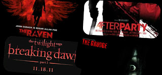
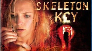 - As directors we chose to keep the props/mise en scene and the use of dialogue to a minimum in order to avoid complications and also focus of the acting and camera work. As our opening is set in a school, we had to make sure that the constumes and the mise en scen communicated that. We had the female protagonist in her school uniform indicating her role and age, we also then had the janitor in a janitor's costume to correspond with his role as well as a trolly. The most important prop we used in the opening was the set of keys, which are also used in thrillers such as 'The Skeleton Key' . Keys represent power and allow you freedom but can also be used to lock and unlock secrets that you want to keep hidden, and we incoorperated them to portray that the female protagonist might be the Janitor's secret he wants to keep away from the world around him until he's ready to give her the keys for her to be able to unlock her future and fulfil her purpose.
Camera work and editing
-The conventional camera shots and movement used in thrillers are

 - Close ups for example in Hitchcock's psycho
- Pov shots for example in kill bill
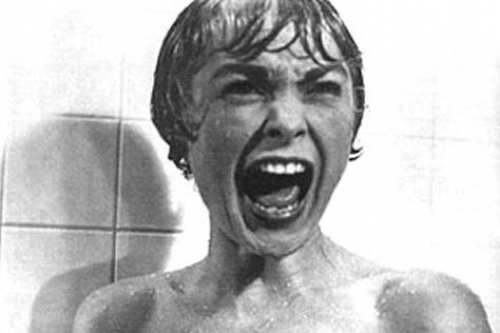
 - Close ups for example in Hitchcock's psycho
 - Pov shots for example in kill bill
- By using our Storyboards to plan a variation of shots, we were able to use camera movements and angles such as tilts, pans, close ups and canted angles to keep the movement in our opening constant to ensure that it didnt become too repetitive and kept the audience engaged.
-Inspired by thrillers such as Shutter Island, Psycho and Seven we realised that we should not use too many long shots but instead to vary our shots and correspond them with the pace of the action. In post Production we found we had many long shots so we had to chose the best parts and cut them down, aswell as incude smooth transitions such as dissolve to make it more fluid.
Title Font and Style
- After doing some title research on the fonts and style for titles we decided to use a shattered and distorted font to represent the relationship between the characters. The font idea was similar to 'The Grudge' font which we altered and made our own. we did alot of research on the type of font and style we wanted and tried to insert complex and higly appealing animations to the font however we ran out of time and we still had not managed to perfect our skills on after effects. Therefore we went for a much more simpler font, style and animation.
Story and how the opening sets it up
our storyline is about a girl who gets bullied and a janitor kidnaps her in order to mentor her to get revenge on those who hurt her but at the end you can see the stockholm syndrome taking place. Our opening sets it up by :
- establishing the characters
- introducing us to the set and location the movie is going to be shot in
- and giving the audience an insight into the storyline through symbolism, and signs but in an ambiguous way therefore the audience can piece the pieces together.
Genre and how the opening suggests it
Our opening suggests the thriller Genre as elements such as these resemble those of a thriller :
- The dark, distorted music suggests that of a thriller as it foreshadows the trouble ahead. This is seen in thrillers such as Seven
- The dark and contrasting lighting, creating mystery and creating a dark atmosphere, suggesting the dark path ahead
- and the isolated , confined locations which represent abandonment and loss of hope aswell as help
How Characters are introduced
- in the beginning of the opening, the camera pans and finds a distraught small girl looking in the mirror. This hints to the audience that the story will centre around her, the flashbacks are then used so the audience get an insight on what she's been through and the abuse she's suffered. We then see a tracking shot of a man walking away from the camera but his face is not revealed until he looks in on the little girl in the bathroom. The fact that this man looks into a little girl suggests his psychologically disturbed nature and tells the audience that a relationship between these two characters is going to be formed.
No comments:
Post a Comment